Retro Bloom
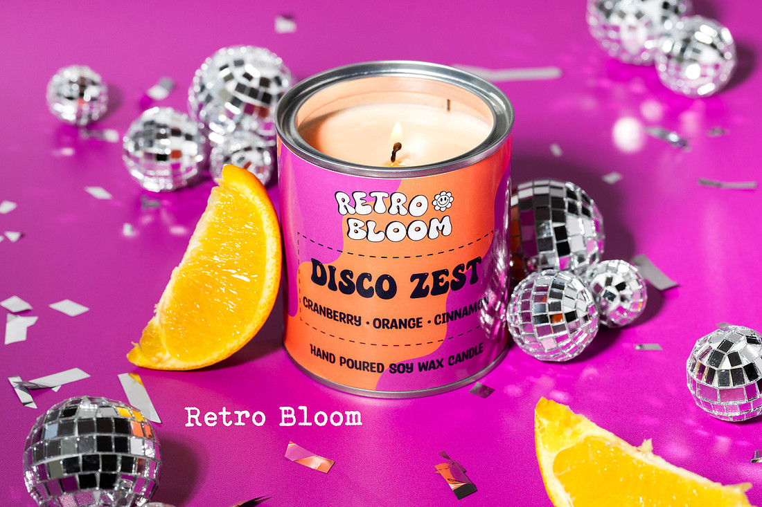
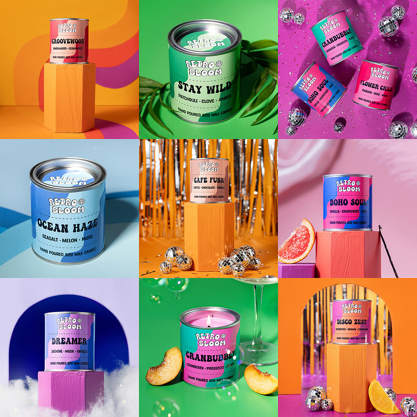
 I love a neutral palette as much as anyone but when Retro Bloom got in touch with a brief full of colour and sparkle I couldn't wait to get started. As with all of m y product shoots, I aim to keep cohesion through an image set, which usually means sticking to a limited colour palette or props and for a while I struggled to decide what the best approach would be for this, whether to make the background softer to create contract with the candle labels or stick to a handful of background options and repeat them. But once the products arrived, a rainbow gut punch of vibrant colour and scent, I realised their cohesion came from their contrast, and the only way to capture that was to lean into it. Between hand shredding foil confetti and making it rain bubbles this session was SO much fun to shoot and I feel like the joy of it all shines through.